Alkylo Organics
Alkylo Organics
My Role
My Role
My Role
Brand & Visual Designer
Services
Services
Services
Creative Direction
Creative Direction
Creative Direction
Visual Identity
Visual Identity
Visual Identity
Tools
Tools
Tools
Adobe InDesign
Adobe InDesign
Adobe InDesign
Adobe Illustrator
Adobe Illustrator
Adobe Illustrator
Adobe Photoshop
Adobe Photoshop
Adobe Photoshop


About the project
About the project
About the project
Overview
Overview
Overview
Alkylo Organics is an Australian skincare brand built around the intersection of nature, science, and holistic skin health. Its approach combines Australian botanicals with scientifically advanced, microbiome-friendly formulations, with a focus on gentle, effective, and sustainable skincare.
The identity was developed to communicate this balance through a visual system that feels natural and sophisticated while still reflecting the brand’s scientific foundation.
Alkylo Organics is an Australian skincare brand built around the intersection of nature, science, and holistic skin health. Its approach combines Australian botanicals with scientifically advanced, microbiome-friendly formulations, with a focus on gentle, effective, and sustainable skincare.
The identity was developed to communicate this balance through a visual system that feels natural and sophisticated while still reflecting the brand’s scientific foundation.
Alkylo Organics is an Australian skincare brand built around the intersection of nature, science, and holistic skin health. Its approach combines Australian botanicals with scientifically advanced, microbiome-friendly formulations, with a focus on gentle, effective, and sustainable skincare.
The identity was developed to communicate this balance through a visual system that feels natural and sophisticated while still reflecting the brand’s scientific foundation.
The Challenge
The Challenge
The Challenge
The challenge was to create a distinctive skincare identity that could bring together two seemingly different worlds: the warmth and authenticity of nature with the precision and innovation of skincare science.
The brand needed to feel trustworthy and approachable while avoiding the overly clinical look often associated with science-led skincare, as well as the generic visual language commonly used by natural and organic brands.
The challenge was to create a distinctive skincare identity that could bring together two seemingly different worlds: the warmth and authenticity of nature with the precision and innovation of skincare science.
The brand needed to feel trustworthy and approachable while avoiding the overly clinical look often associated with science-led skincare, as well as the generic visual language commonly used by natural and organic brands.
The challenge was to create a distinctive skincare identity that could bring together two seemingly different worlds: the warmth and authenticity of nature with the precision and innovation of skincare science.
The brand needed to feel trustworthy and approachable while avoiding the overly clinical look often associated with science-led skincare, as well as the generic visual language commonly used by natural and organic brands.
Solution
Solution
Solution
I developed a cohesive visual identity that bridges nature and science through a refined, earthy aesthetic.
A botanical-inspired logo establishes the connection to nature, while a structured typographic system and clean layouts introduce a sense of precision and clarity. A deep green-led palette, complemented by earthy neutrals, gold, and light green, reinforces the brand’s natural foundation while adding warmth and sophistication.
The visual direction combines botanical ingredients, skincare textures, natural skin photography, and laboratory-inspired imagery to express the relationship between natural ingredients and scientific innovation.
I developed a cohesive visual identity that bridges nature and science through a refined, earthy aesthetic.
A botanical-inspired logo establishes the connection to nature, while a structured typographic system and clean layouts introduce a sense of precision and clarity. A deep green-led palette, complemented by earthy neutrals, gold, and light green, reinforces the brand’s natural foundation while adding warmth and sophistication.
The visual direction combines botanical ingredients, skincare textures, natural skin photography, and laboratory-inspired imagery to express the relationship between natural ingredients and scientific innovation.
I developed a cohesive visual identity that bridges nature and science through a refined, earthy aesthetic.
A botanical-inspired logo establishes the connection to nature, while a structured typographic system and clean layouts introduce a sense of precision and clarity. A deep green-led palette, complemented by earthy neutrals, gold, and light green, reinforces the brand’s natural foundation while adding warmth and sophistication.
The visual direction combines botanical ingredients, skincare textures, natural skin photography, and laboratory-inspired imagery to express the relationship between natural ingredients and scientific innovation.




Logo Concept
Logo Concept
Logo Concept
The logo combines the “A” from Alkylo, a scientific beaker, and a leaf to represent the brand’s connection between science and nature.
The logo combines the “A” from Alkylo, a scientific beaker, and a leaf to represent the brand’s connection between science and nature.
The logo combines the “A” from Alkylo, a scientific beaker, and a leaf to represent the brand’s connection between science and nature.


Kakadu Plum
Kakadu Plum
Kakadu Plum
Unique to Australia
Unique to Australia
Unique to Australia
Kakadu Plum, native to northern Australia, particularly the Kakadu National Park in the Northern Territory. It adds a distinct Australian touch to the brand.
Kakadu Plum, native to northern Australia, particularly the Kakadu National Park in the Northern Territory. It adds a distinct Australian touch to the brand.
Kakadu Plum, native to northern Australia, particularly the Kakadu National Park in the Northern Territory. It adds a distinct Australian touch to the brand.
Cultural Significance
Cultural Significance
Cultural Significance
Indigenous Australians have been using Kakadu Plum for its medicinal properties for centuries. Including it in the brand can reflect a commitment to respecting and incorporating indigenous knowledge.
Indigenous Australians have been using Kakadu Plum for its medicinal properties for centuries. Including it in the brand can reflect a commitment to respecting and incorporating indigenous knowledge.
Indigenous Australians have been using Kakadu Plum for its medicinal properties for centuries. Including it in the brand can reflect a commitment to respecting and incorporating indigenous knowledge.
Sustainability
Sustainability
Sustainability
Ensure that the brand practices sustainable sourcing of Kakadu Plum, aligning with the ethos of organic skincare.
Ensure that the brand practices sustainable sourcing of Kakadu Plum, aligning with the ethos of organic skincare.
Ensure that the brand practices sustainable sourcing of Kakadu Plum, aligning with the ethos of organic skincare.


Golden Wattle
Golden Wattle
Golden Wattle
National Emblem
National Emblem
National Emblem
Golden Wattle, is Australia's national floral emblem, making it a symbol that resonates with national pride and identity. Using it in the logo can create a strong connection with Australian consumers.
Golden Wattle, is Australia's national floral emblem, making it a symbol that resonates with national pride and identity. Using it in the logo can create a strong connection with Australian consumers.
Golden Wattle, is Australia's national floral emblem, making it a symbol that resonates with national pride and identity. Using it in the logo can create a strong connection with Australian consumers.
Resilience
Resilience
Resilience
The Golden Wattle is known for its resilience and adaptability, which can be a powerful metaphor for the benefits of organic skincare product’s offer to the skin.
The Golden Wattle is known for its resilience and adaptability, which can be a powerful metaphor for the benefits of organic skincare product’s offer to the skin.
The Golden Wattle is known for its resilience and adaptability, which can be a powerful metaphor for the benefits of organic skincare product’s offer to the skin.
Symbol of Renewal
Symbol of Renewal
Symbol of Renewal
Wattle blooms in spring, symbolizing renewal and freshness. This aligns well with the concept of skincare, promoting rejuvenation and healthy skin.
Wattle blooms in spring, symbolizing renewal and freshness. This aligns well with the concept of skincare, promoting rejuvenation and healthy skin.
Wattle blooms in spring, symbolizing renewal and freshness. This aligns well with the concept of skincare, promoting rejuvenation and healthy skin.
Cultural Significance
Cultural Significance
Cultural Significance
Wattle has cultural significance in Indigenous Australian communities. However, it's important to approach its use with respect and cultural sensitivity, potentially consulting with experts to ensure appropriate representation.
Wattle has cultural significance in Indigenous Australian communities. However, it's important to approach its use with respect and cultural sensitivity, potentially consulting with experts to ensure appropriate representation.
Wattle has cultural significance in Indigenous Australian communities. However, it's important to approach its use with respect and cultural sensitivity, potentially consulting with experts to ensure appropriate representation.



Brand Applications
Brand Applications
Brand Applications
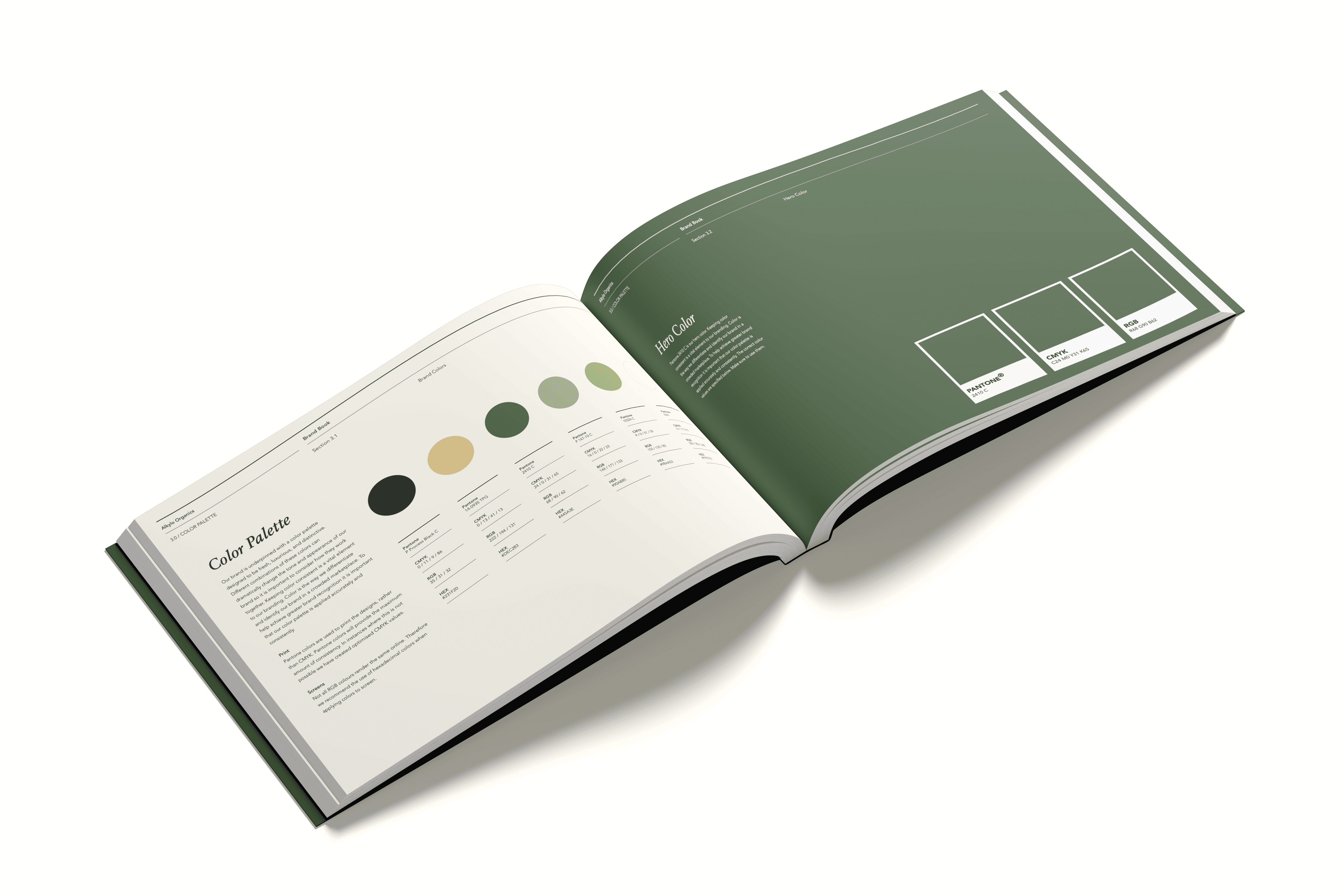
The final identity was applied across the brand book, digital assets, stationery, and merchandise to create a cohesive and consistent brand experience across different touchpoints.
The final identity was applied across the brand book, digital assets, stationery, and merchandise to create a cohesive and consistent brand experience across different touchpoints.
The final identity was applied across the brand book, digital assets, stationery, and merchandise to create a cohesive and consistent brand experience across different touchpoints.
Other works
Other works
Other works


NEVE
NEVE
NEVE
Branding
Branding
Branding
Creative Direction
Creative Direction
Creative Direction


BABYFACE
BABYFACE
BABYFACE
Social Media
Social Media
Social Media
Video
Video
Video
UI Design
UI Design
UI Design


Jason Wu Beauty
Jason Wu Beauty
Jason Wu Beauty
Social Media
Social Media
Social Media
Web Banners
Web Banners
Web Banners